Does my society look big in this? Understanding the numbers
penguin | 10.02.2011 21:55 | Analysis | Public sector cuts


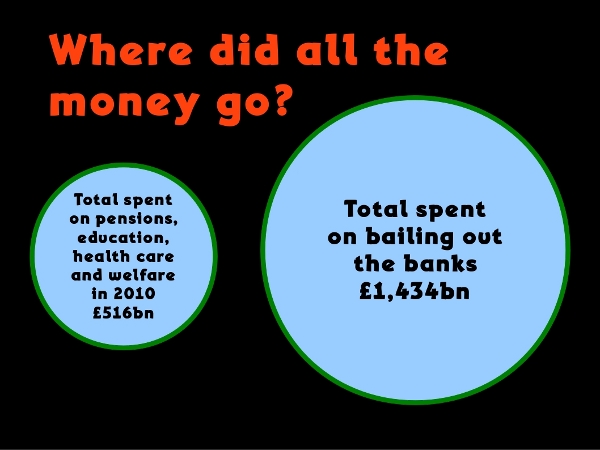
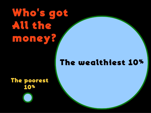
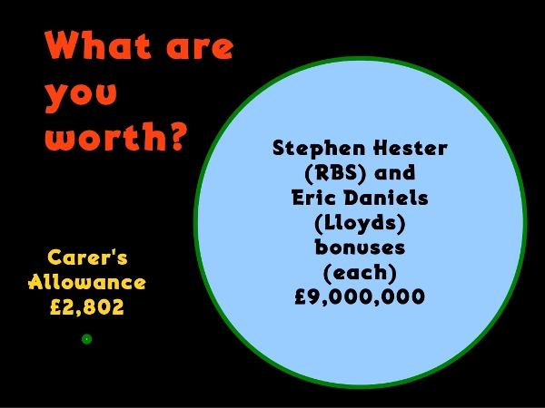
I've tried to understand this by making some images. It's almost like we're being ripped off and told lies ;-)
Sources for the data available from my blog.
penguin
 Homepage:
http://penguin.ox4.org/node/586
Comments
Display the following 14 comments